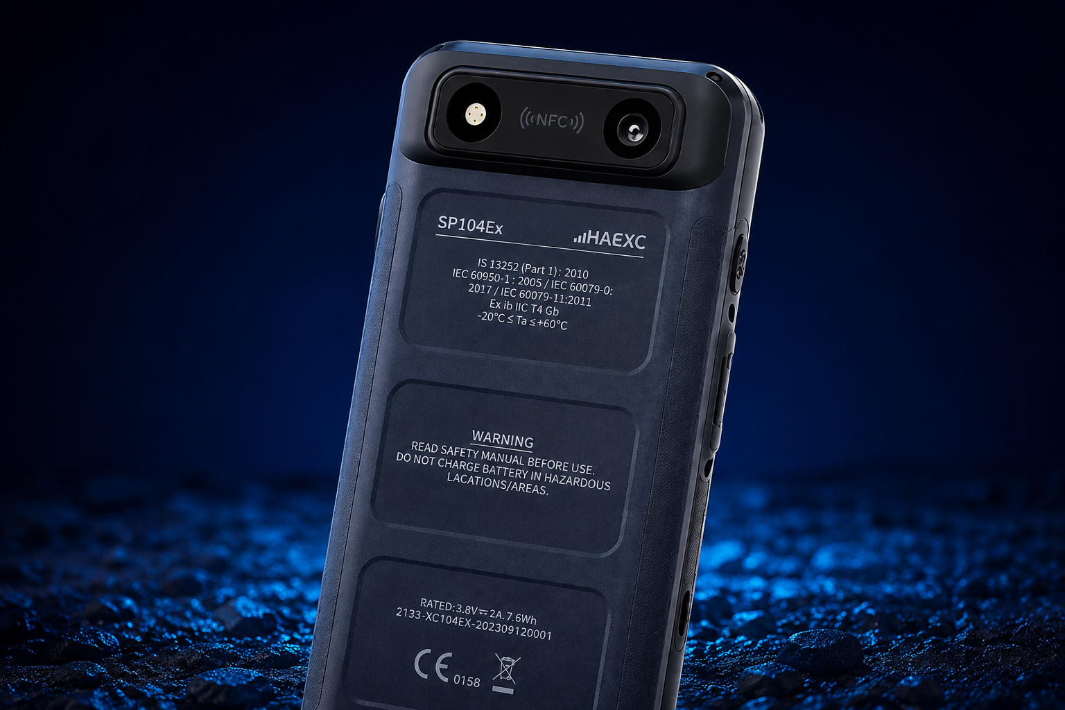
The existing visuals lacked consistency, and the overall experience struggled to scale across different touchpoints. As the system expanded across platforms, features, and use cases, the absence of a clear framework led to fragmentation, misalignment, and difficulty in maintaining visual cohesion, clarity, and long-term consistency throughout the experience. The project required a design and digital system that could stand out with confidence while remaining clear, usable and easy to navigate across every touchpoint every time with impact always and everywhere.